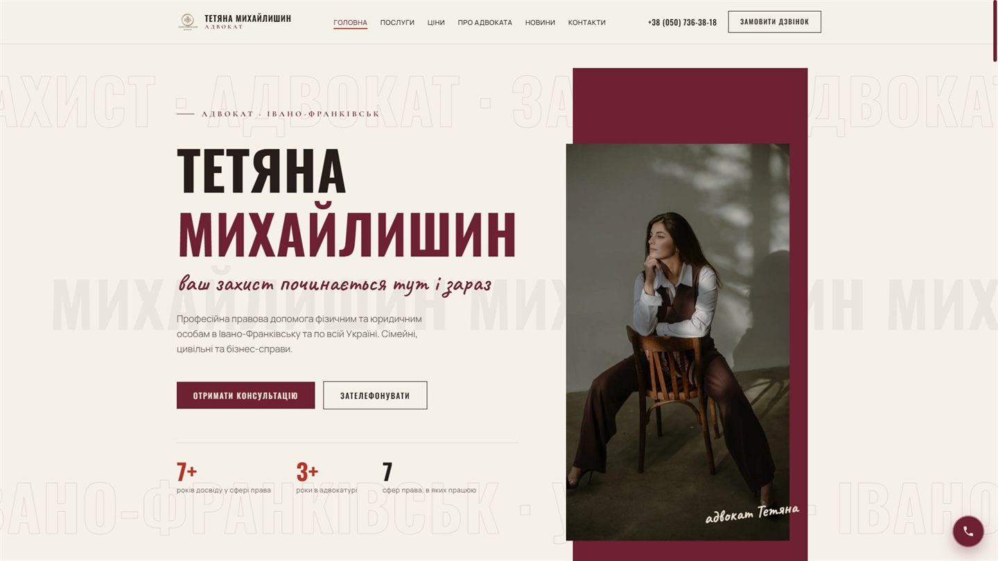
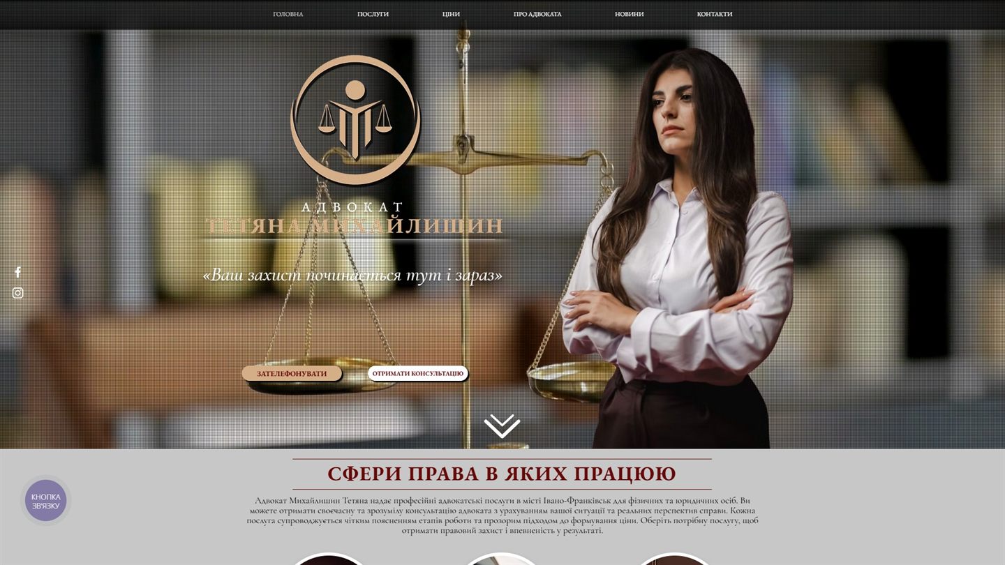
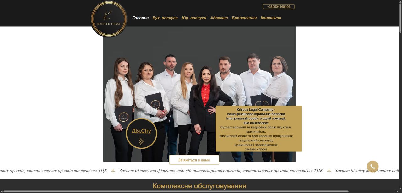
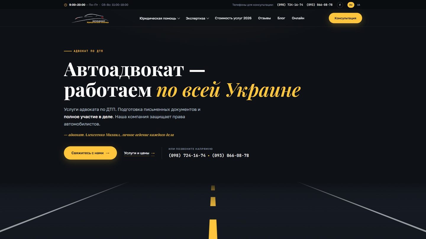
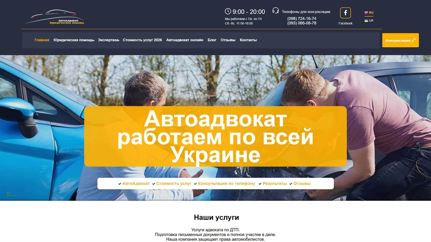
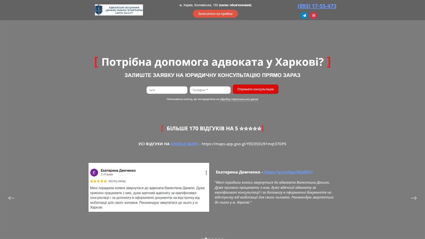
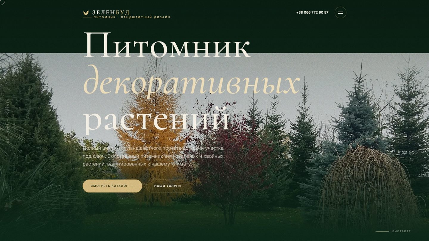
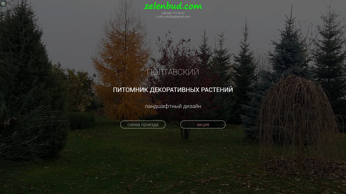
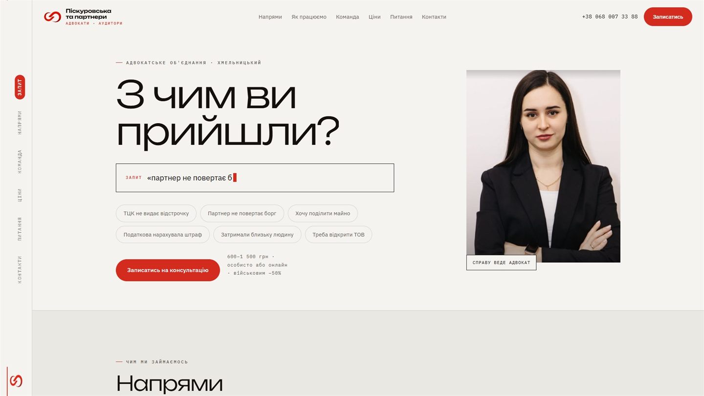
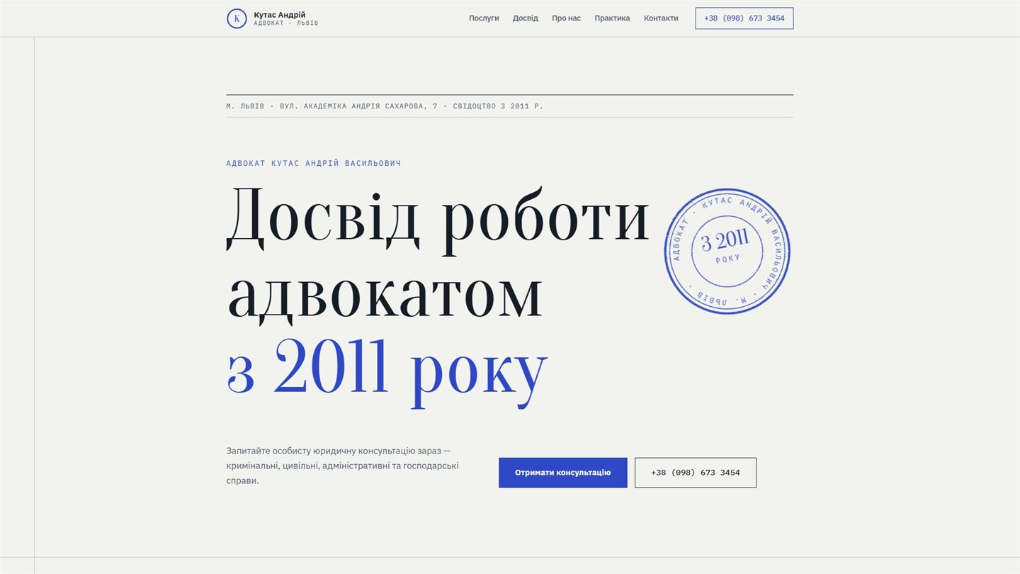
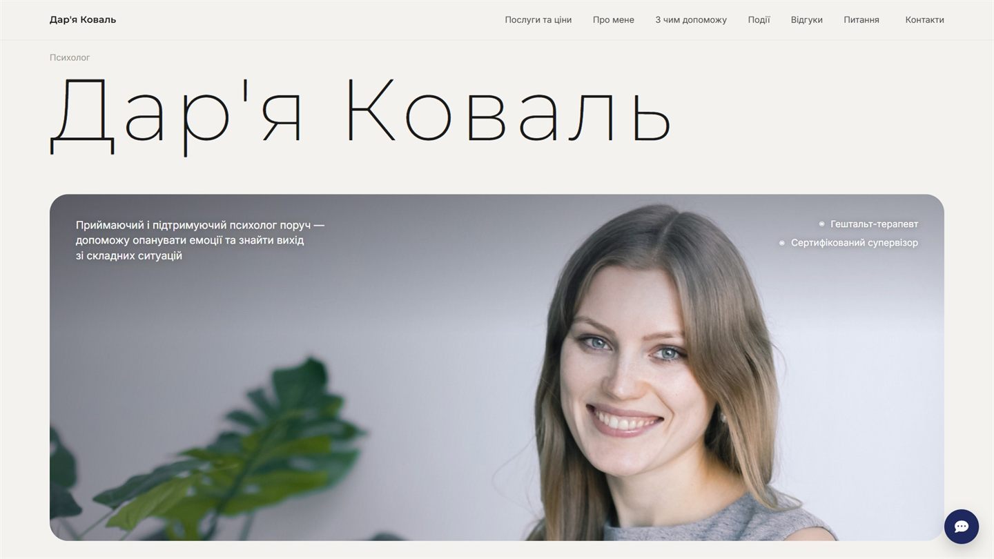
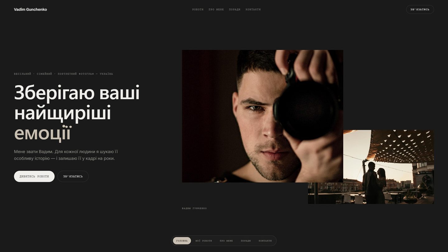
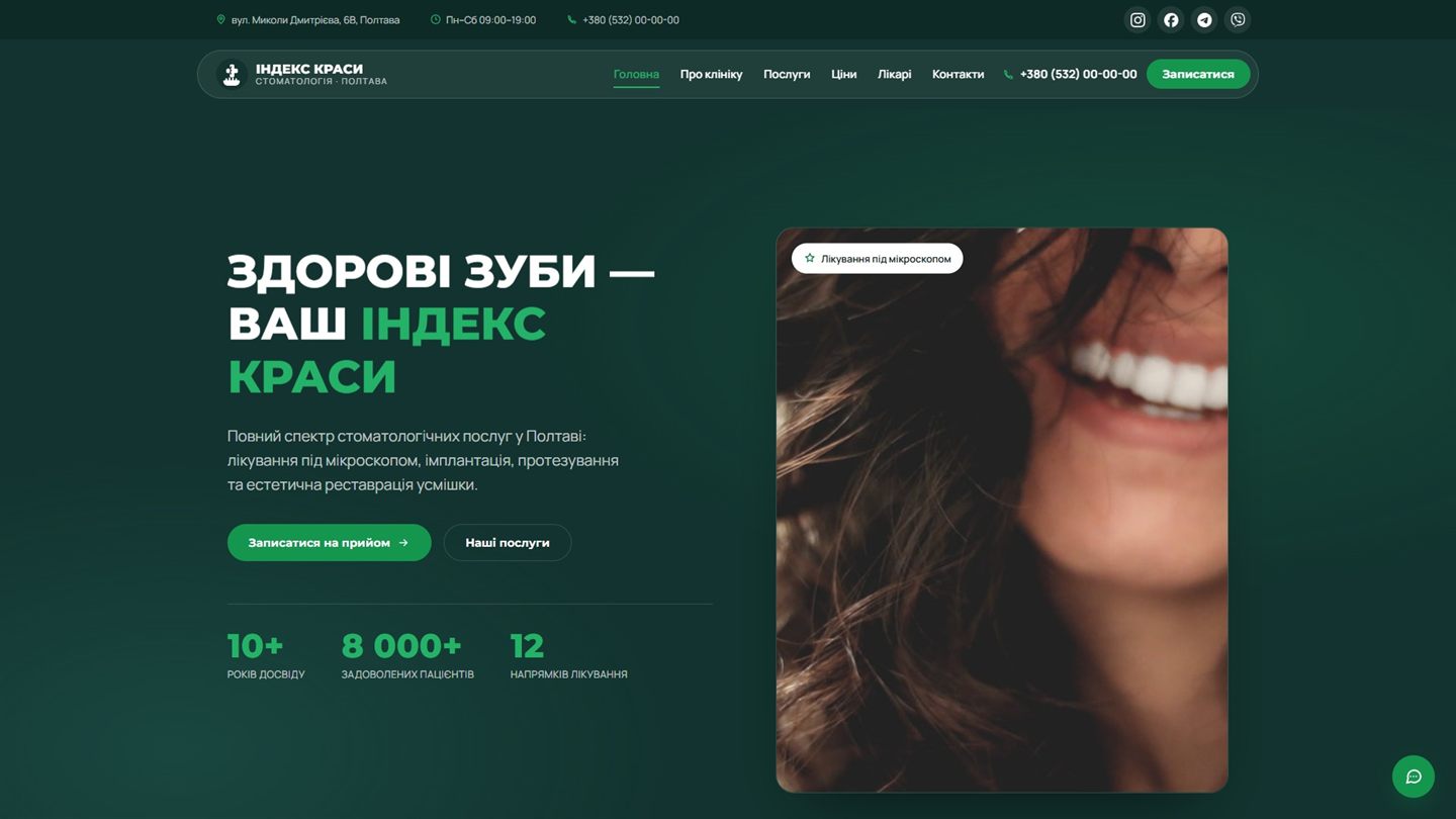
Drag the slider to the left to see the site the business lived with before me.
The old site was dark, a pretty quote stood where the offer should be, and the phone number was buried at the bottom. Now the name, the practice area and the city are the first thing you see, and you can call straight from the header.
Open the site
02
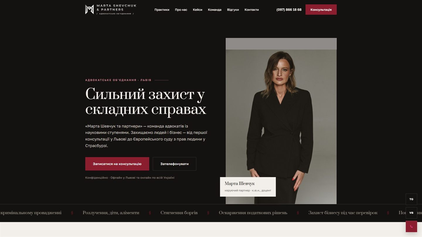
Marta Shevchuk & Partners
law firm · Lviv
redesign
There used to be a half-screen video and three screens of solid text — nobody reads pages like that. Now it is clear at once what kind of cases people bring here, with a booking button right next to it.
Open the site
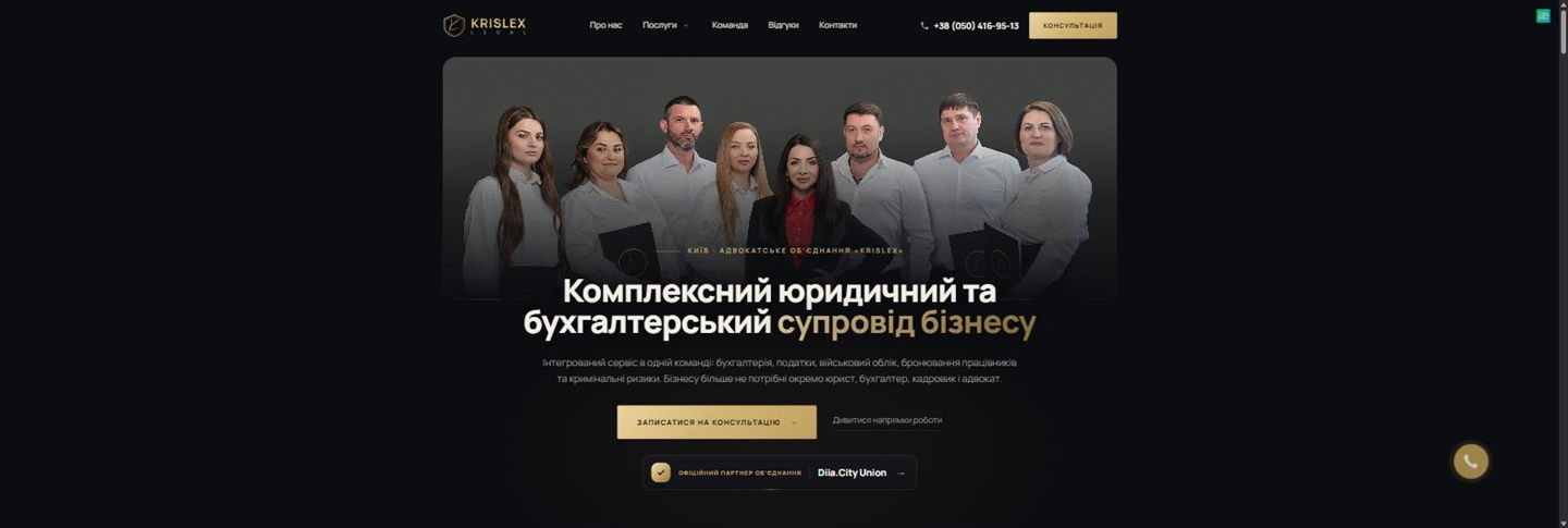
A team photo filled the first screen and the services hid somewhere below. Now the practice areas, prices and how the work runs are all visible without endless scrolling.
After a crash people look for a phone number, not a nice picture. Now both numbers are visible immediately, and the services are sorted by situation.
Open the site
05
Danylo, Halinkin & Partners
law firm · Kharkiv
redesign
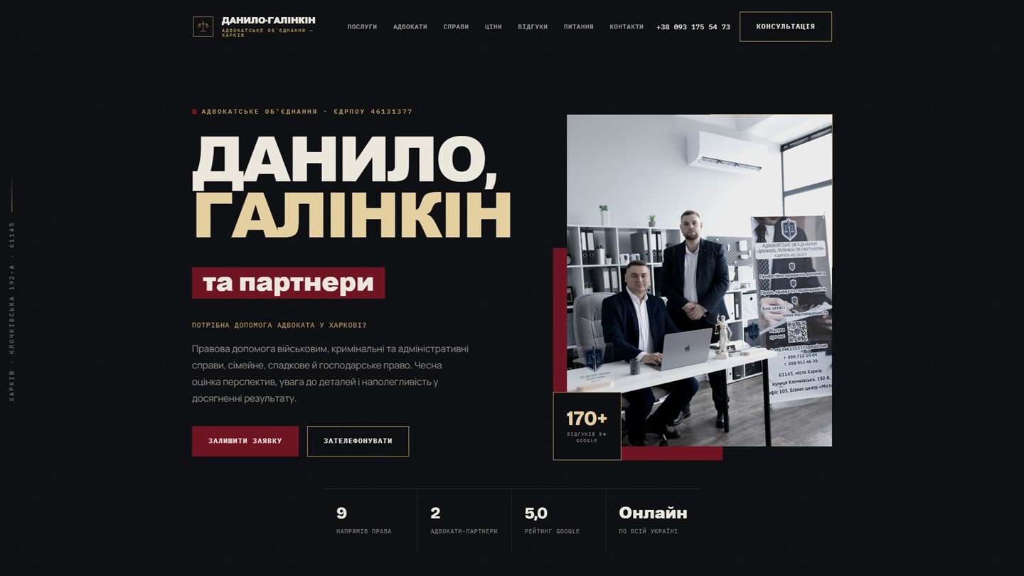
The reviews were pasted in as Google screenshots — it looked like a temporary placeholder. Now there is a photo of the team, 170+ reviews as one number, and the company registry code in the header.
Open the site
The top of the page used to hold just the words "zelenbud.com" and two buttons — "directions" and "sale". Now the plant catalogue leads, and the services are laid out step by step.
Open the site